
Best approach to understand different plots & applications as a beginner data analyst/scientist
In this post you are going to learn about Histogram plot from manual sketching to plotting with python programming and application.
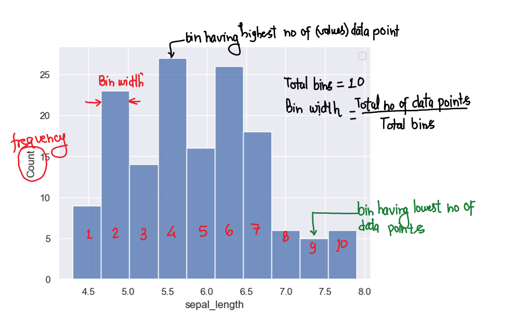
What is histogram ?
It is a chart that plots the distribution of a numeric variable’s values as a series of bars.
Each bar covers a range of numeric values called a bin or range of groups or class.
Bar’s height shows the frequency(no of occurrence) of data points with a value within the corresponding bin/class.
This chart displays the shape and spread of continuous sample data.
Consider this: If we want to know the age of everyone in the college, we can look at:
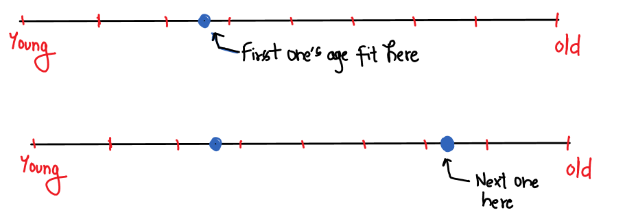
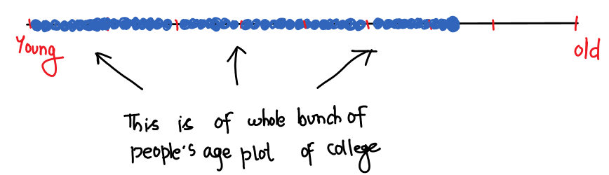
But you can see here that there are lots of people, whose ages may be the same or very close to each other; due to this, there are many dots (data points) that overlap & completely hidden too. So we try to put the same age values one over the other, as below.
However, there are many hidden values due to many adjacent values (age), such as 2 people having age 33 year 6 month, 3 people having age 33 year, 6 people having age 33 year 8 month…, 4 people having age 35 year, 6 people having age 35 year 4 month, 2 people having age 35 year 2 month, and so on. If you plot these values around 33, you’ll see that there are still hidden values.
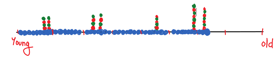
So instead of putting same values one over the other like in column form, we divided the range of values( here age) into bins and put all values one over the other in the same bin, looking like this:

This is Histogram plot of data.
Observations
(1) You can easily tell how many people belong to which age group, for example, 15 people between the ages of 0 and 10, 11 people between the ages of 10 and 15, and so on.
(2) Most people are young, belonging to the 0–20 year age group.
This way, there can be many observations, depending on your problem.
So from this plot, you can predict the probability of getting new values. for example, if you are getting new values, then it will have a higher probability that it belongs to the young group (0–20 years) because from the above plot you can see most of the values belong to that group (15+11 = 26 people).
No of bins matter depends on data & problems
Let’s say we have only two bins for the above data. Then the plot will look like:
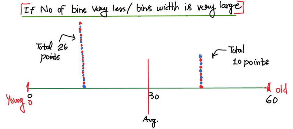
Best point to observe: 26 people above average age (30 years) and 10 people below.
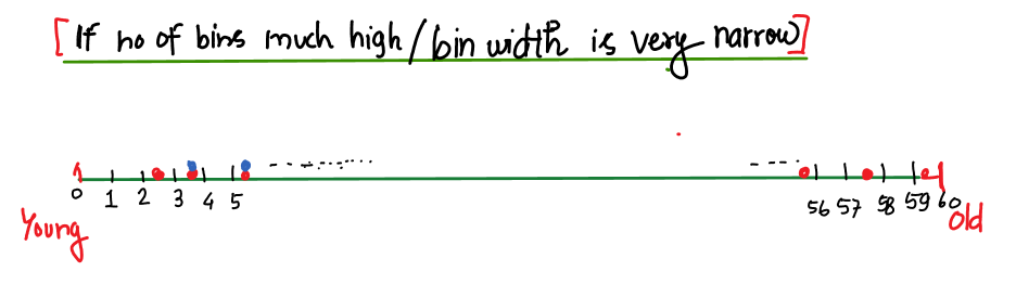
Best point to observe: adjacent age groups count.
In this way, you’ve learned that the number of bins or the width of the bins matters in histograms, so to solve your problem, plot histograms for different – different bins and observe them.
Now that you understand the histogram plot as a beginner in the field of data analyst/data scientist, your next problem will be how to plot all variations of given data. If there are data having a small number of data points in it, then it will be easy to plot all variations of the histogram manually with a pen and paper, but in today’s world there are data having a huge number of data sets (in the thousands or millions ) in it, so manual plotting is a very tough and time-consuming process, which will also increase the cost of the solution. Here comes the role of programming languages for data analysis like Python, R, etc.
Plotting histogram with python
First of all, you have to install Python 3, then install Jupyter Notebook, Numpy, Pandas, Matplotlib, and Seaborn.
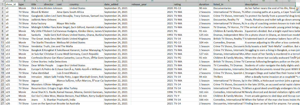
Download the netflix shows data from https://www.kaggle.com/datasets/shivamb/netflix-shows
Data will look like this:
Code to plot the histogram to know the distribution of movies and shows releasing on Netflix yearly:
| import seaborn as sns import pandas as pd df = pd.read_csv(r’D:\Blog\1_Histogram\archive\netflix_titles.csv’) sns.histplot(data = df,bins = 5) |
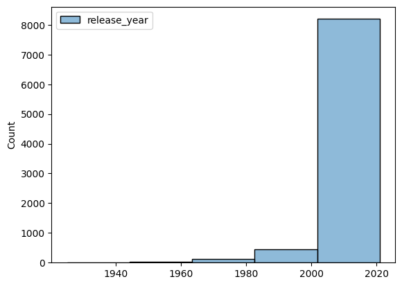
The movie and show bins (ranges) are 20 years. Each bar here includes all shows and movies in batches of 20 years. For example, we can see that around ~ 7500 shows were released between 2000 and 2020.
Let’s visualise a histogram (distribution) plot in batches of 1 year. First, let’s select the column name ‘release_year’.
| import seaborn as sns import pandas as pd import numpy as np df = pd.read_csv(r’D:\Blog\1_Histogram\archive\netflix_titles.csv’) data = df[‘release_year’] print(data) |
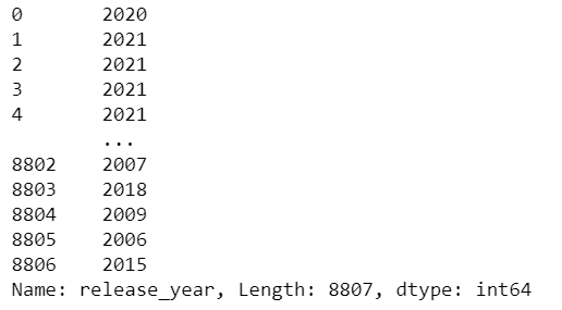
You can see a total of 8806 rows, meaning total movies and shows = 8807. Now, before plotting it, we need to convert it into a list with the following code:
| b = np.arange(min(data), max(data) + 1, 1) print(b) |
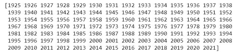
You can see the data starts from 1925 to 2021, i.e., a total of 96 years of data. Let’s now plot it with the following code:
| sns.histplot(data, bins= b) |
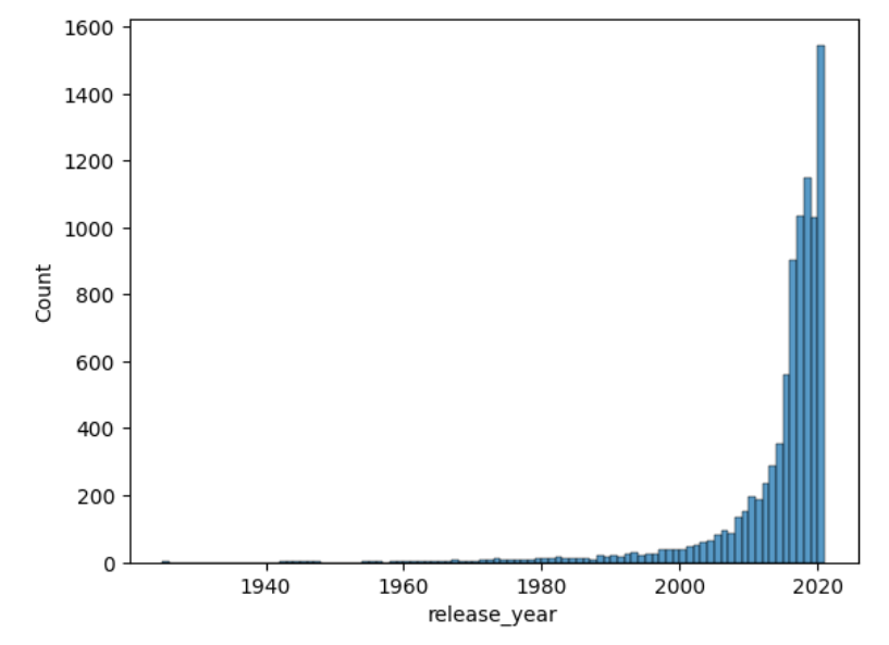
Full code looks like this:
| import seaborn as sns import pandas as pd import numpy as np df = pd.read_csv(r’D:\Blog\1_Histogram\archive\netflix_titles.csv’) data = df[‘release_year’] b = np.arange(min(data), max(data) + 1, 1) sns.histplot(data, bins= b) |
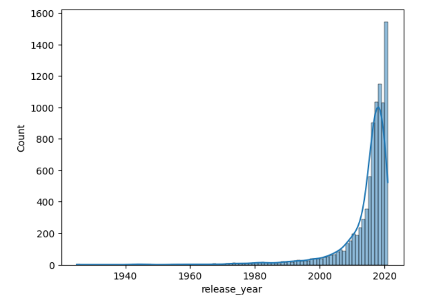
If you want to view smoother, then you can plot kernel density by writing the following code:
| import seaborn as sns import pandas as pd import numpy as np df = pd.read_csv(r’D:\Blog\1_Histogram\archive\netflix_titles.csv’) data = df[‘release_year’] t = df[‘type’] b = np.arange(min(data), max(data) + 1, 1) sns.histplot(data, bins= b, kde=True) |
Let’s now plot the normal density in the histogram:
| import seaborn as sns import pandas as pd import numpy as np df = pd.read_csv(r’D:\Blog\1_Histogram\archive\netflix_titles.csv’) data = df[‘release_year’] t = df[‘type’] b = np.arange(min(data), max(data) + 1, 1) sns.histplot(data, bins= b, kde=False, stat=’density’) |
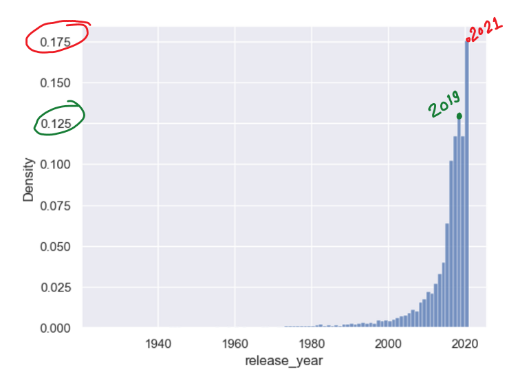
You can observe that highest ~ 17.5 % of total movies/shows were released in 2021 while second highest ~ 13.5 % in 2019.
If you want to see the normal distribution for movies as well as TV shows in the same histogram, then code:
| import seaborn as sns import pandas as pd import numpy as np df = pd.read_csv(r’D:\Blog\1_Histogram\archive\netflix_titles.csv’) data = df[‘release_year’] b = np.arange(min(data), max(data) + 1, 1) sns.histplot(data= df, x = ‘release_year’, bins= b, kde=False, stat = ‘density’, hue = ‘type’) |
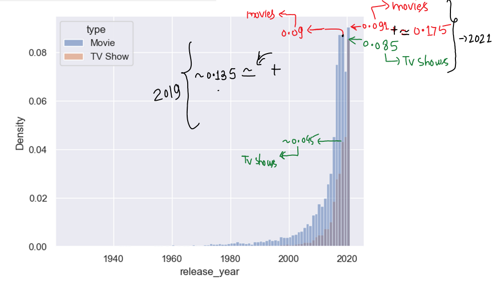
Observations
(1) In 2021 ~ 9.1% movies of total movies upto 2021, ~ 8.5% tv shows of total shows upto 2021 were released.
(2) In 2019 ~ 9% movies of total movies upto 2021, ~ 4.5% tv shows of total shows upto 2021 were released.
Applications
(1) To analyse and predict footfall in a restaurant on the basis of age, time, day, month, etc.
(2) As the exam date countdown begins, the number of study hours for students increases.
(3) More people tend to go outside for movies or travel at the weekend, so we can predict their expenditure will rise on Saturday and Sunday and their footfall at malls will peak at the weekend.
This way, there can be many more applications.
You can try our new python course for beginners: Python For Beginners